

Dayda.Studio Brand System
Brand Identity & Strategy
© 2026
Dayda.Studio Brand System
Brand Identity & Strategy
© 2026
Dayda.Studio Brand System
Brand Identity & Strategy
(01)
(Read More)
© 2025
Creating an identity that reads as a language we are yet to learn
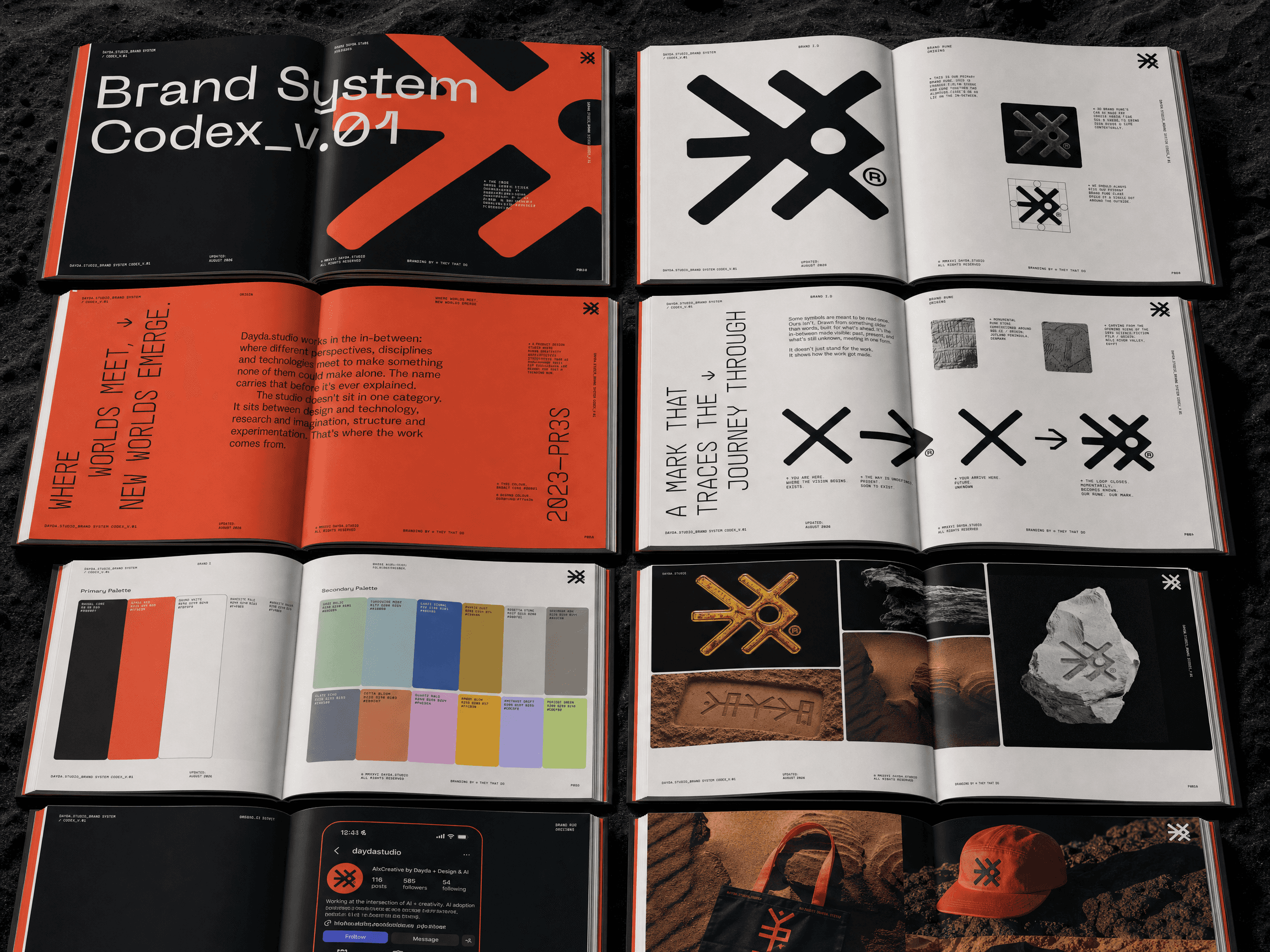
DAYDA comes from de aquí y de allá, from here and from there. The rebrand started by de-branding away from boring visual averages rife in the AI sphere. We wanted to express DAYDA for what we have come to represent: discovery of the future yet unknown, almost like uncovering an ancient-future language, alien to our eyes but fascinating nonetheless. Our identity needed to represent the elemental building blocks of what this future will bring.The mark reads like a script nobody has learned yet. The rune at its centre closes a loop between where you're standing and where you're going. Around it sits a palette named for the materials the planet made - basalt, granodiorite, sediment, ash - and those names seed every texture we generate. The result looks excavated and perfectly capture the feeling of intrigue and discovery.Brand design in collaberation with Vincent Howcutt at They That Do.
(De-brand before rebranding)
The old identity had picked up the visual habits of the sector we sit beside: soft gradients, a friendly sans, the general reassurance of a company that wants you to feel calm about AI. We threw all of it out before drawing anything, opting to start from the ground to create a truer, more emotional expression of this strange new world.
Runes, glyphs and carved stone slide into fantasy or sci-fi without careful applicatory consideration. We treated the references as material instead of decoration, going back to the carvings at Xochicalco, the cave marks at El Castillo, the Jelling stones and the Rosetta fragment, and looking at how the tool met the rock and how a visceral textures and materiality itself becomes the expression of the unknown. The mark is geometric and built on a strict grid, with no distressing and no ornament anywhere in it, a careful collision of elements that represent journey and the discovery. All the weathering happens in the textures around it, never in the logo.


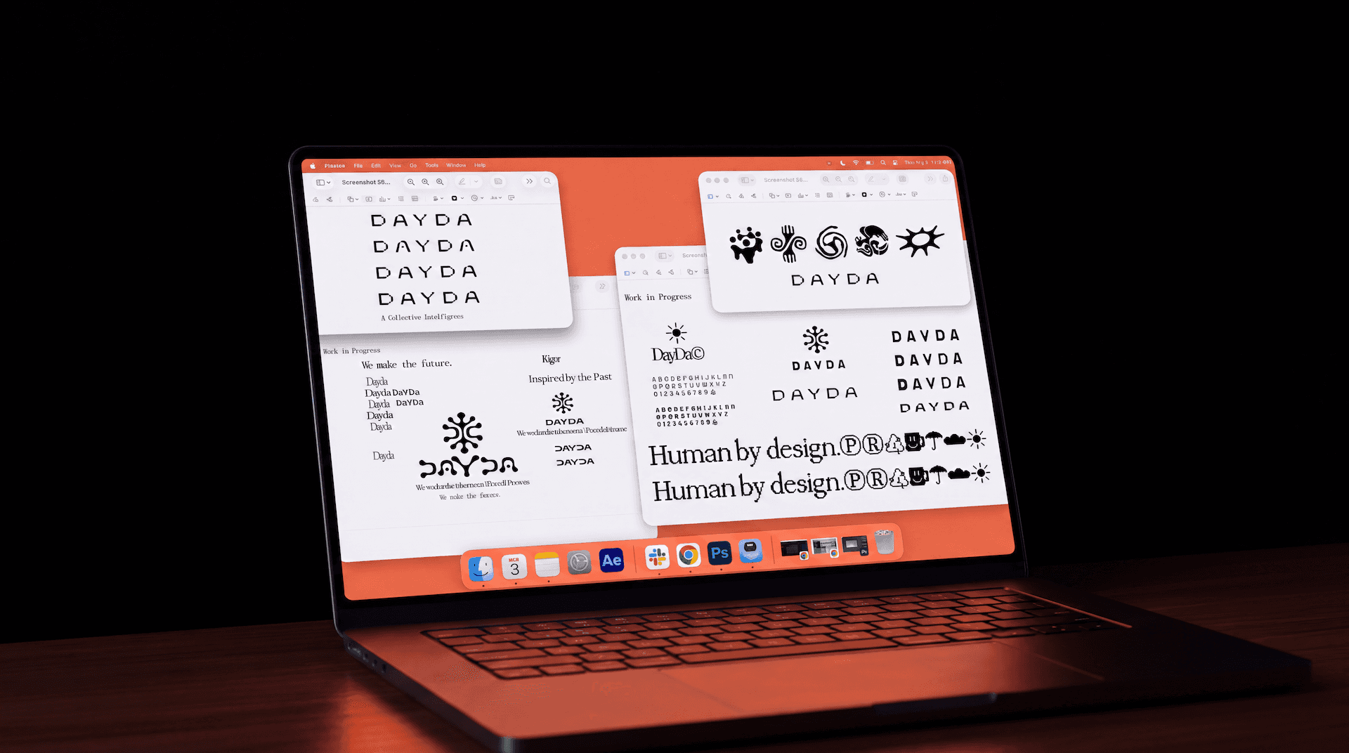

The identity is a visual contradiction by design. It feels like something excavated yet everything it describes is ahead of us. The branding captures that contraditction, representing our 'third space' - a elemental, mid-formation translation layer between the creative industry that was and the one currently reassembling itself.The system is built to keep producing. Colour names double as prompt seeds, so the texture library grows without drifting. The rune exists in 3D and takes any material we give it, which means a pitch can carry the client's own surface without the mark stopping being ours. The codex runs to 26 pages and sets a floor to build upon. It says so on the first spread: built to be filled in, argued with, and rewritten.
2 Months
Rebrand end-to-end
26
Pages of Brand defining Codex


"Our rebranding was a de-branding effort as much as it was a reinvention. We wanted to strip our branding back to the fundamental building blocks of creativity and our final identity represents our feeling of being a third-space, a translation layer between the creative industry that once was and the fundamental reforming of creative work in our immediate present and future. Almost archaeology of a future which is yet to happen."
Rupert Warries - Creative Director

(01)
(Read More)
© 2025
Creating an identity that reads as a language we are yet to learn
DAYDA comes from de aquí y de allá, from here and from there. The rebrand started by de-branding away from boring visual averages rife in the AI sphere. We wanted to express DAYDA for what we have come to represent: discovery of the future yet unknown, almost like uncovering an ancient-future language, alien to our eyes but fascinating nonetheless. Our identity needed to represent the elemental building blocks of what this future will bring.The mark reads like a script nobody has learned yet. The rune at its centre closes a loop between where you're standing and where you're going. Around it sits a palette named for the materials the planet made - basalt, granodiorite, sediment, ash - and those names seed every texture we generate. The result looks excavated and perfectly capture the feeling of intrigue and discovery.Brand design in collaberation with Vincent Howcutt at They That Do.
(De-brand before rebranding)
The old identity had picked up the visual habits of the sector we sit beside: soft gradients, a friendly sans, the general reassurance of a company that wants you to feel calm about AI. We threw all of it out before drawing anything, opting to start from the ground to create a truer, more emotional expression of this strange new world.
Runes, glyphs and carved stone slide into fantasy or sci-fi without careful applicatory consideration. We treated the references as material instead of decoration, going back to the carvings at Xochicalco, the cave marks at El Castillo, the Jelling stones and the Rosetta fragment, and looking at how the tool met the rock and how a visceral textures and materiality itself becomes the expression of the unknown. The mark is geometric and built on a strict grid, with no distressing and no ornament anywhere in it, a careful collision of elements that represent journey and the discovery. All the weathering happens in the textures around it, never in the logo.
The identity is a visual contradiction by design. It feels like something excavated yet everything it describes is ahead of us. The branding captures that contraditction, representing our 'third space' - a elemental, mid-formation translation layer between the creative industry that was and the one currently reassembling itself.The system is built to keep producing. Colour names double as prompt seeds, so the texture library grows without drifting. The rune exists in 3D and takes any material we give it, which means a pitch can carry the client's own surface without the mark stopping being ours. The codex runs to 26 pages and sets a floor to build upon. It says so on the first spread: built to be filled in, argued with, and rewritten.
2 Months
Rebrand end-to-end
26
Pages of Brand defining Codex
"Our rebranding was a de-branding effort as much as it was a reinvention. We wanted to strip our branding back to the fundamental building blocks of creativity and our final identity represents our feeling of being a third-space, a translation layer between the creative industry that once was and the fundamental reforming of creative work in our immediate present and future. Almost archaeology of a future which is yet to happen."
Rupert Warries - Creative Director
(01)
(Read More)
Creating an identity that reads as a language we are yet to learn
DAYDA comes from de aquí y de allá, from here and from there. The rebrand started by de-branding away from boring visual averages rife in the AI sphere. We wanted to express DAYDA for what we have come to represent: discovery of the future yet unknown, almost like uncovering an ancient-future language, alien to our eyes but fascinating nonetheless. Our identity needed to represent the elemental building blocks of what this future will bring.The mark reads like a script nobody has learned yet. The rune at its centre closes a loop between where you're standing and where you're going. Around it sits a palette named for the materials the planet made - basalt, granodiorite, sediment, ash - and those names seed every texture we generate. The result looks excavated and perfectly capture the feeling of intrigue and discovery.Brand design in collaberation with Vincent Howcutt at They That Do.
(De-brand before rebranding)
The old identity had picked up the visual habits of the sector we sit beside: soft gradients, a friendly sans, the general reassurance of a company that wants you to feel calm about AI. We threw all of it out before drawing anything, opting to start from the ground to create a truer, more emotional expression of this strange new world.
Runes, glyphs and carved stone slide into fantasy or sci-fi without careful applicatory consideration. We treated the references as material instead of decoration, going back to the carvings at Xochicalco, the cave marks at El Castillo, the Jelling stones and the Rosetta fragment, and looking at how the tool met the rock and how a visceral textures and materiality itself becomes the expression of the unknown. The mark is geometric and built on a strict grid, with no distressing and no ornament anywhere in it, a careful collision of elements that represent journey and the discovery. All the weathering happens in the textures around it, never in the logo.
The identity is a visual contradiction by design. It feels like something excavated yet everything it describes is ahead of us. The branding captures that contraditction, representing our 'third space' - a elemental, mid-formation translation layer between the creative industry that was and the one currently reassembling itself.The system is built to keep producing. Colour names double as prompt seeds, so the texture library grows without drifting. The rune exists in 3D and takes any material we give it, which means a pitch can carry the client's own surface without the mark stopping being ours. The codex runs to 26 pages and sets a floor to build upon. It says so on the first spread: built to be filled in, argued with, and rewritten.
2 Months
Rebrand end-to-end
26
Pages of Brand defining Codex
"Our rebranding was a de-branding effort as much as it was a reinvention. We wanted to strip our branding back to the fundamental building blocks of creativity and our final identity represents our feeling of being a third-space, a translation layer between the creative industry that once was and the fundamental reforming of creative work in our immediate present and future. Almost archaeology of a future which is yet to happen."
Rupert Warries - Creative Director
(02)
(Portfolio)
© 2025
(02)
(Portfolio)


(03)
(Frequently Asked Questions)
WHO IS ACTUALLY DOING THE WORK; Human or AI?
WHO OWNS THE WORK, AND HOW DO YOU HANDLE IP?
CAN YOU WORK INSIDE OUR TEAM AND ON OUR existing STACK?
WHAT HAPPENS TO CUSTOM workflows and TOOLING WHEN THE PROJECT ENDS?
DO WE HAVE TO COMMIT TO A FULL PROGRAMME?
(03)
(Frequently Asked Questions)
WHO IS ACTUALLY DOING THE WORK; Human or AI?
WHO OWNS THE WORK, AND HOW DO YOU HANDLE IP?
CAN YOU WORK INSIDE OUR TEAM AND ON OUR existing STACK?
WHAT HAPPENS TO CUSTOM workflows and TOOLING WHEN THE PROJECT ENDS?
DO WE HAVE TO COMMIT TO A FULL PROGRAMME?
(03)
(Frequently Asked Questions)
WHO IS ACTUALLY DOING THE WORK; Human or AI?
WHO OWNS THE WORK, AND HOW DO YOU HANDLE IP?
CAN YOU WORK INSIDE OUR TEAM AND ON OUR existing STACK?
WHAT HAPPENS TO CUSTOM workflows and TOOLING WHEN THE PROJECT ENDS?
DO WE HAVE TO COMMIT TO A FULL PROGRAMME?